Design & UX
Design Vision
Design is what makes your shop and brand stand out from the crowd and builds your audience's feelings towards your brand. But design for the web isn't just about beauty, it's also about user experience.
The aesthetic-usability effect refers to users' tendency to perceive attractive products as more usable:
People tend to believe that things that look better will work better - even if they aren't actually more effective or efficient.
This doesn't mean that usability is not a key aspect, but emphasises the fact that a beautiful design contributes to the user's perception of a good and usable shop.
When we started development on this new generation of our product, design was our primary focus and we started with a clean sheet. The main points for our design vision were:
Take our decisions not on opinions, but on reliable data
Create a design system that is flexible and customizable so that shops can stand out from the crowd
Adhere to industry standards and offer consistency
Create user interfaces that are easy to use and increase conversions
Decisions Driven By Data
The first thing we wanted was to create our design vision not around personal preferences and biases, but around hard facts.
It is often the case that merchants or less experienced designers look at what the big players on the market are doing and try to copy it as precisely as possible, in the hopes of also copying their success. Sometimes it's just copying cool looking ideas they stumbled upon on random sites on the Internet.
While inspiration is definitely a part of the design process, blindly copying from others is like trying to copy from a random classmate during an exam, not even realising that everyone has a different questionnaire.
In the design process it is critical to understand the explanation for why something works or doesn't work, in order to understand when to apply it and when not to apply it.
At Zento, our design team avidly follows the eCommerce design research papers published by the Baymard Institute as well as other sources, in a pursuit of understanding with scientific precision what works when and why. This allows the team to propose the best possible design components to be used in designing of any shop.
Additionally, the team constantly monitors the performance of the various design components in production and runs A/B tests to gather additional data that powers future decisions.
Atomic Design System
Shops have different design requirements depending on a variety of factors, so we needed to build a design system for Zento that offers the flexibility needed to allow all the required customizations. The answer is the Atomic Design System.
The Atomic Design Methodology (a term coined by Brad Frost) is explained as:
Atomic design is not a linear process, but rather a mental model to help us think of our user interfaces as both a cohesive whole and a collection of parts at the same time.

Atomic Design is composed of 5 distinct stages working together to create interface design systems in a more deliberate way and hierarchical manner:
Atoms: foundational building blocks of the interface, which cannot be broken down further without loosing their meaning (examples: icons, text or image elements, form labels, input box, buttons)
Molecules: groups of atoms working together as a single unit (examples: product boxes)
Organisms: relatively complex UI elements composed of groups of molecules, atoms and even other organisms (examples: product carousel, product grid, header, footer)
Templates: pages that combine components into a layout and define/articulate the underlying content structure (example: layout of a page)
Pages: specific instances of templates that show what a UI looks like with real representative content in place (the final product)
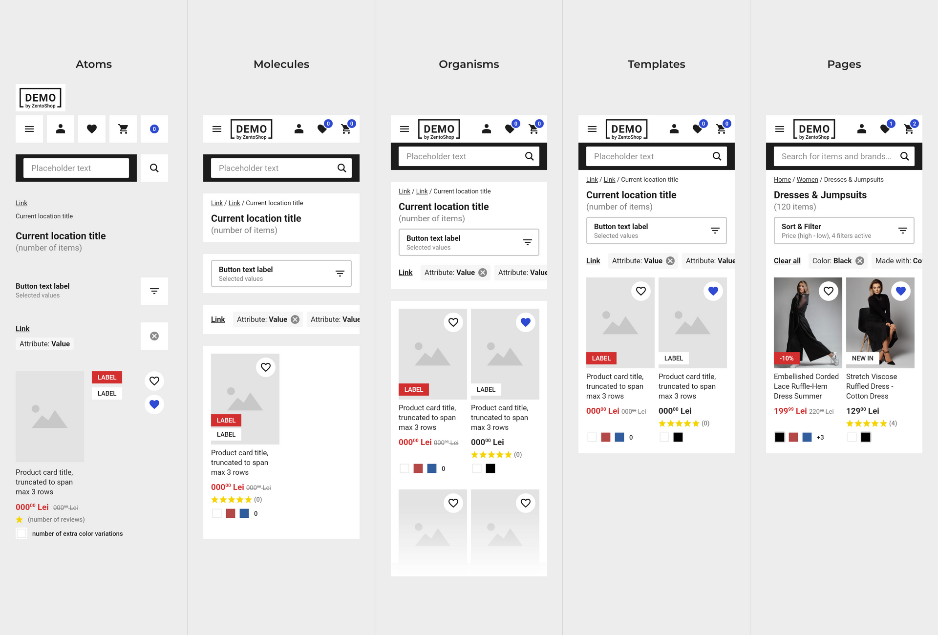
So Zento's design system has several versions for each atom (input box, button, title etc.); these atoms can be bundled together into components that have several variations as well, which themselves get merged into one of the many variations of organisms available and so on. It's like Lego for design.
Consistency & Standards
The implicit benefit of the atomic design system is that interfaces built with such a system are consistent: since the same variation of an atom (like a text input for example) is used throughout the site, the user will have a consistent experience.
One of Jakob Nielsen's (co-founder of Nielsen Norman Group) Usability Heuristics is Consistency & Standards:
Users should not have to wonder whether different words, situations, or actions mean the same thing. Follow platform conventions.
This is crucial for ensuring that your UI is predictable and learnable.
There are two types of consistency that apply to user experience design:
Internal: refers to maintaining consistency within the user interface (adhering to the established visual treatments)
External: maintaining consistency outside of the product or shop; this means following patterns that the users are already accustomed to
Internal consistency is quite straightforward: if your shop uses certain design elements, it should use them consistently throughout the shop; the cart icon should be the same between pages, form elements should use the same styles, colors need to be consistent and so on.
The easiest way to explain external consistency is through Jakob's Law:
Users spend most of their time on other sites. This means that users prefer your site to work the same way as all the other sites they already know.
Your shoppers have pre-existing expectations on how a feature should work and where it should be placed. If a design breaks these conventions, it will be forcing the user to learn something new, which may increase the cognitive load. This does not mean that you can't break a convention, but if you do, you need to make sure that it is worth it and that the pattern or solution you propose is better and easy to understand.
Usability For Increased Conversions
In today's world, users expect the shops they visit to be fast and intuitive, regardless of the device they use. It is already a well known fact that poor experience is one of the main reasons why users don't convert, and this is especially true with poor experience on mobile; it's sometimes an immediate switch to a competitor and other times a more subtle
this doesn't work right, I'll get back to this later when I'm at my computer
which then doesn't materialise in a sale; in any scenario, your shop loses an order after an expensive customer acquisition process.
With mobile shopping on the rise and some users even being mobile-only, designing a shop for mobile can't be an afterthought.
Our design vision at Zento starts with the mobile shopper in mind: design components are crafted to be optimal for the mobile display and be tap friendly; interfaces are designed to hint to offscreen components; layouts remove or include additional elements on mobile compared to desktop in order to compensate for the user's screen size.
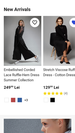
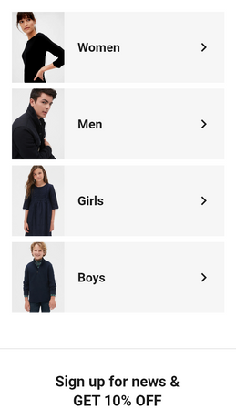
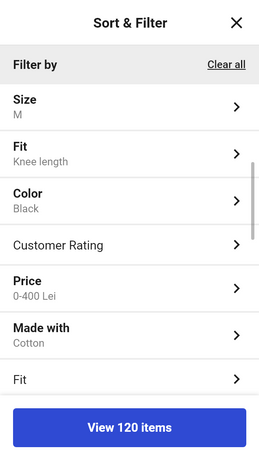
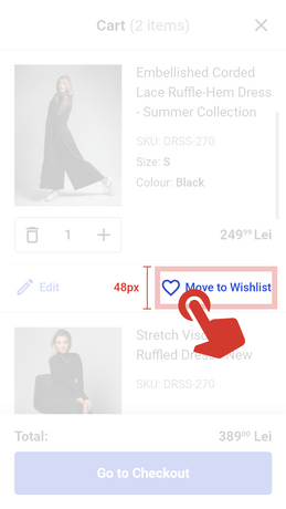
Designing interfaces that are easy to use on any device and in any context is at the core of our design vision.
Design is not only about beautiful layouts or smooth animations but also about understanding your users and making their journey be as easy and pleasant as possible. This is how design drives conversion and increases your shop’s bottom line.

