Design & UX
General Design & UX
The design is made up of all the design elements in the shop that constitute the user interface (UI), which together with flow and functionality make up the user experience (UX).
Creating a customer-focused design has several steps that a professional designer follows: the process always starts with understanding the business requirements, understanding the brand, vision & buyer personas, learning about the vertical & competition, and devising a plan on how the shop should look & feel. Once that's done, the design process continues with deciding the style.
Style Guide
In this step, the designer decides on typography, color scheme and spacing rules that will be used throughout the design. This step not only makes the entire process be streamlined, but also ensures consistency is respected throughout the shop.
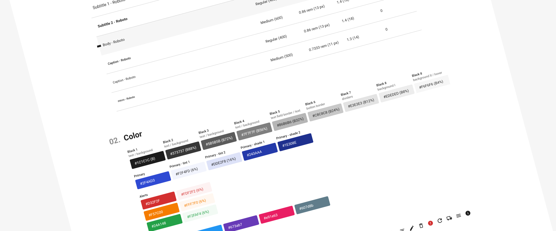
Zento's design system has the following main components:
Typography: font family, weight, size, line height and letter spacing for regular text and all heading types
Color: selection of primary and secondary colors as well as their derived colors and grayscales
Iconography: set of all icons used for controls and actions
Layout: element padding, spacing and display grid on all device sizes
UI Components and their interactive states: Buttons, Links, Form elements, Notifications, Tabs & Pop-ups
With an extensive variety of styles for all the components available to choose from or completely customize, the look & feel of the shop can be tailored to provide a perfect customer experience, without compromising on visual consistency.
Navigation
With a design system in place, the first step in the interface is deciding the navigation. Depending on the shop's category tree and the way users expect to navigate throughout the site, the first major decision relates on how to organise and display the navigation.
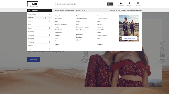
Zento has an ever extending set of available layouts to choose from and depending on the number of categories on each level of the navigation or the navigation depth, the right navigation design can be used for each case. Depending on the vertical and users' expectations, the design might need to allow a quick drill-down into the category tree or it might need to do a guided approach.
Here are a few examples out of the dozens of navigation options available:
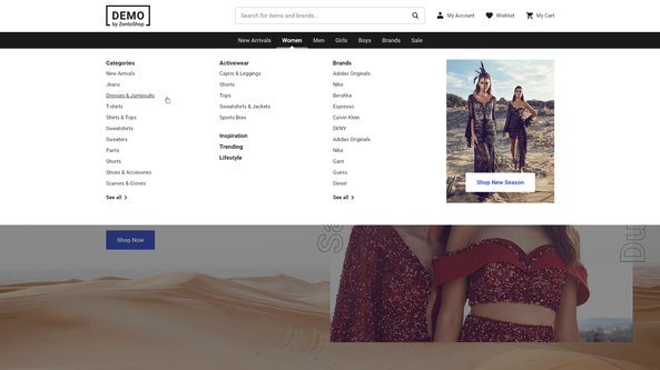
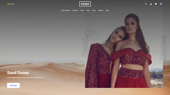
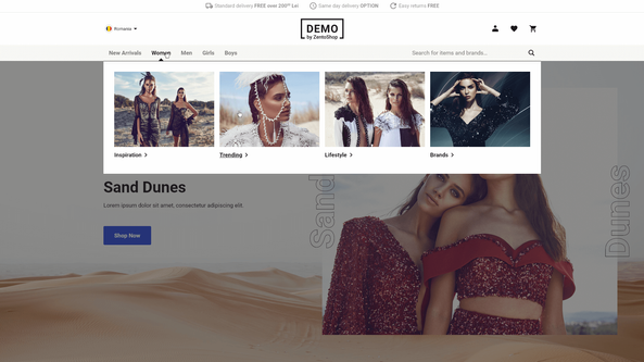
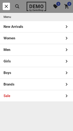
On mobile, due to the small screen size and lack of mouse hover functionality, most of the navigation layouts are hidden behind a menu icon, however how the menu looks behind that icon has lots of variations.
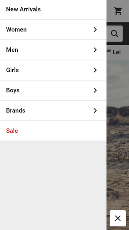
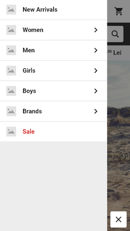
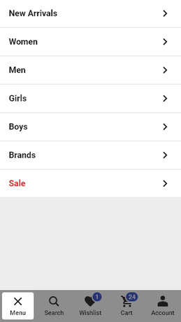
Header
Once a navigation style is chosen, the next step is to design the rest of the header. Beside the navigation and site logo, the header contains the link to the cart so the user can glance at how many products he has in his cart, link to user account or login so the user can easily access his account details and order history, link to the user's wishlist if that feature is activated, the search, a secondary navigation if needed and the main USP (or unique selling proposition).
The style of the navigation allows decisions on whether the navigation should be compact or have more whitespace, have icons, text or both, have an expanded search or just a search icon, be in color contrast with the rest of the site or blend in as well as a variety of layout decisions with the positioning and ordering of all the elements.
On mobile the header is more compact and the goal is to give the user access to all the important functionalities, while taking up as little vertical space as possible; important decisions can be made on whether the search is displayed or hidden behind an icon or on whether an account icon is always visible or hidden inside the navigation drawer.
Homepage Content
For those visitors who enter a site through the homepage, this page is uniquely important as it will inform the users of what kind of products this shop sells and how it is different from its competitors. Zento offers the complete freedom to manage the homepage content using our own Page Builder functionality optimized for marketers, so that changing the content of any page in the site, including the homepage, is as easy as designing a newsletter with drag-and-drop.
The default homepage content proposed by a designer in the initial setup phase, focuses on giving the user a shortcut to the most important categories, which on mobile is quite important since they are hidden inside the navigation drawer, present the most important products and campaigns and call-to-action elements the shop needs to promote as well as communicate the brand's mission and unique selling proposition to the buyer. The home page's goal is to capture the attention of users who don't immediately use the search or navigation to get to the page they're looking for and guide them to products and categories that might interest them.
The key element is that there is no universally right or wrong design, but it always depends from case to case on the vertical, the catalog and the brand. Even with the rich component and layout choices that Zento offers, making the correct decisions in a given situation is what makes designers an essential part of the shop creation process.
User Goals
The journey from a visitor to a buyer is not always a straight line, so you shop should address the needs of the 5 main types of e-commerce users:
product-focused (know exactly what they want) ⇒ key elements: effective search, easy access to previously purchased items, a streamlined checkout
browsers (access their favorite sites looking for inspiration or to kill time) ⇒ key elements: listings of new, popular & sale products, easy access to inventory
researchers (they're collecting information about products & prices) ⇒ key elements: user reviews, easy comparison between products, easy-to-edit shopping carts
bargain hunters (are looking for the best deal possible) ⇒ key elements: display sale items, applying discounts automatically when criteria is met
one-time shoppers (are gift card recipients, or gift buyers) ⇒ key elements: efficient site navigation, checkout without registration.
Designing with user types & and their goals in mind can help inform decisions that provide a better user experience.

